A sweet French rebellion

Client
Cookine
Sector
F&B
Services
BrandingArt DirectionMotion Graphics
Cookine isn’t your average cookie brand. It’s bold, indulgent and a little mischievous. The kind of brand that dares you to take a bite before you’ve even seen the menu. Our client wanted a visual identity that could capture that energy and stand out in a crowded market. In this case study, we walk through the branding, art direction and motion graphics that brought Cookine’s playful confidence to life, creating a look and feel that’s impossible to ignore.
Colors you can taste
A palette built to tempt. Cream and Frosting keep things light and sweet. Cherry brings punch. Indoughgo and Midnight add depth. Recognizable at a glance, built for packaging, campaigns and screens.
Frosting
#ffa8cd
RGB 255 168 205
Cherry
#fa2b3f
RGB 250 43 63
Indoughgo
#0039ad
RGB 0 57 173
Blueberry
#0a0d23
RGB 10 13 35
Cream
#f7f5f2
RGB 247 245 242
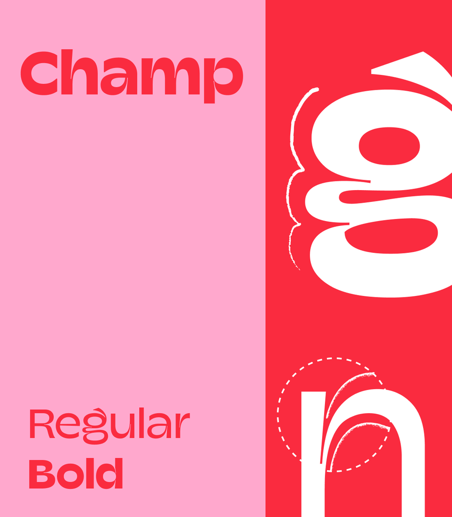
Typography with attitude
A type system that reads clean at speed but still winks. Champ leads with bold warmth and personality.
Fonts with flavor
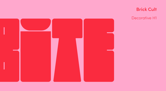
For an extra wink, Brick Cult appears as a decorative H1. Playful, punchy, and impossible to ignore.
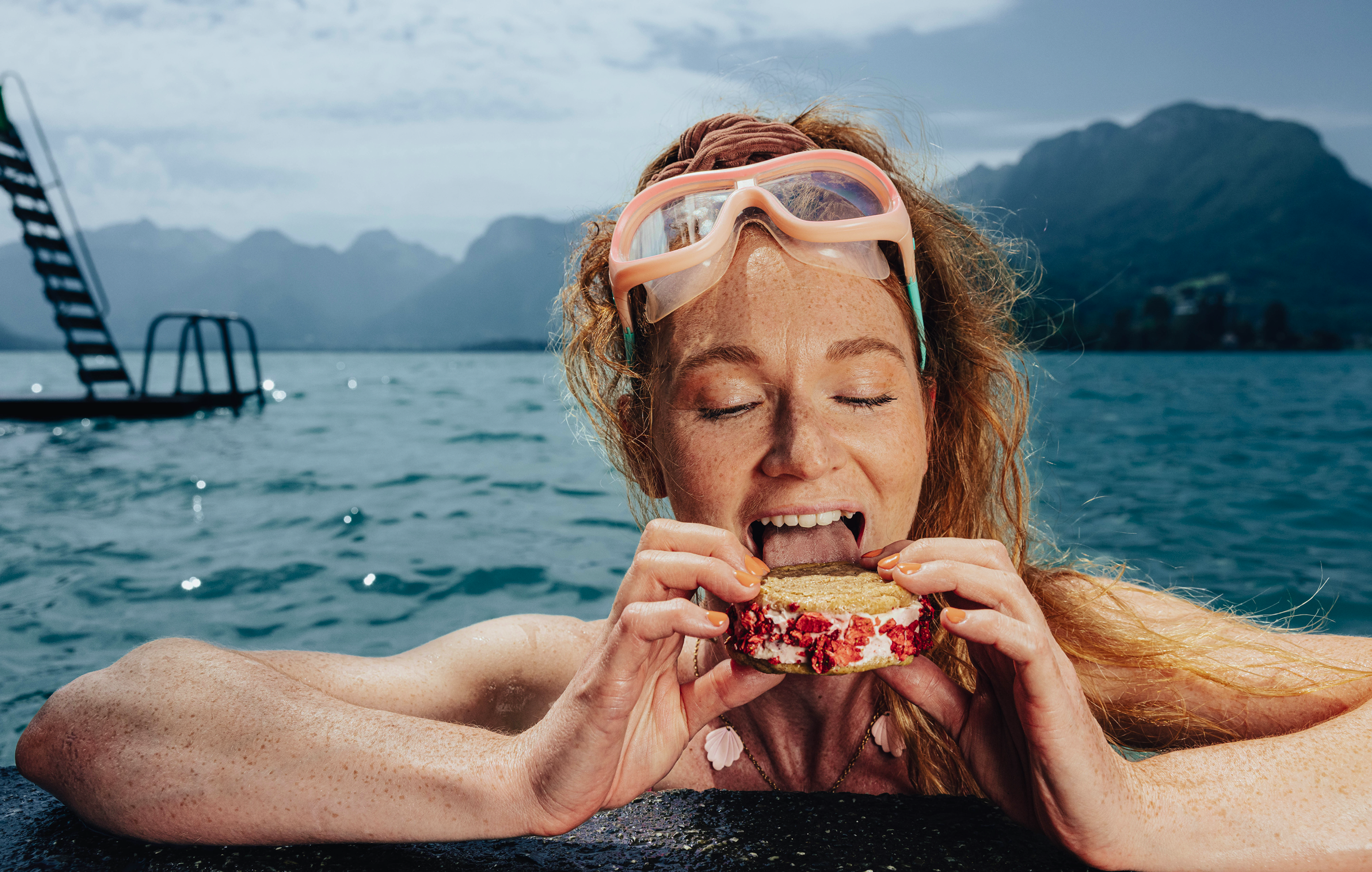
Photography with a heartbeat

We built mood boards full of color, warmth and motion, then shot real moments, not perfect poses — laughter, connection, a little mess. Every frame invites a bite.

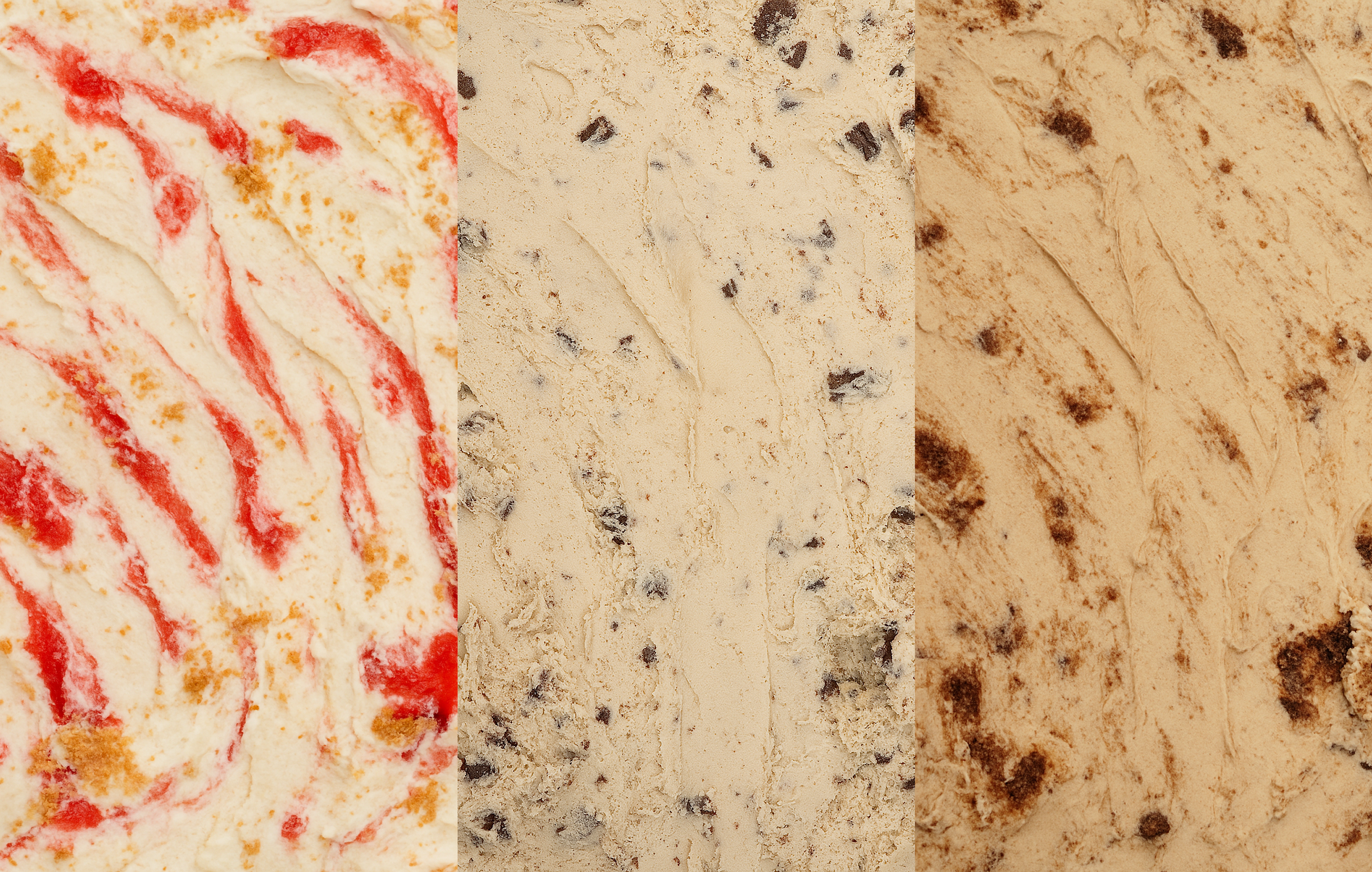
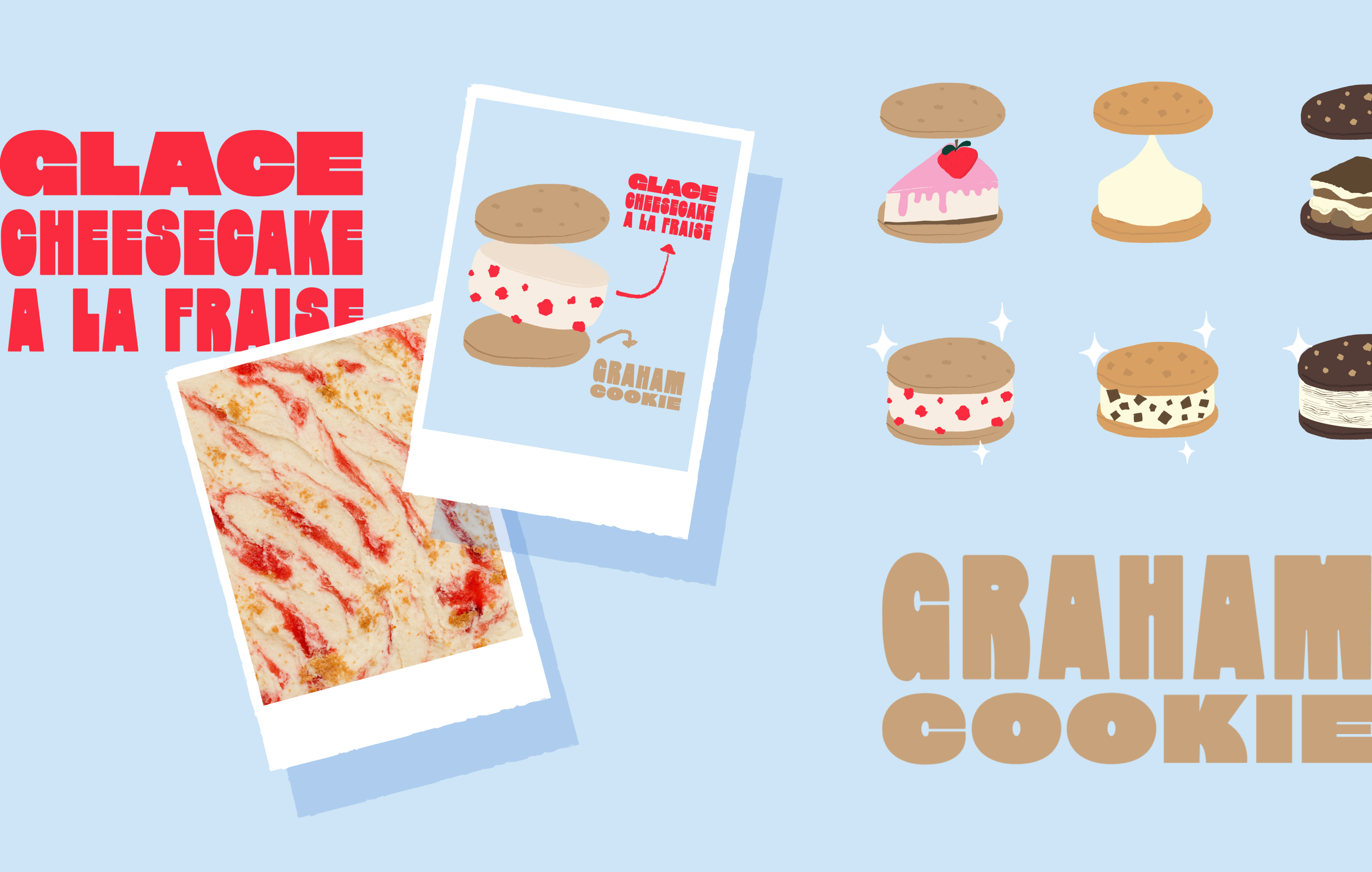
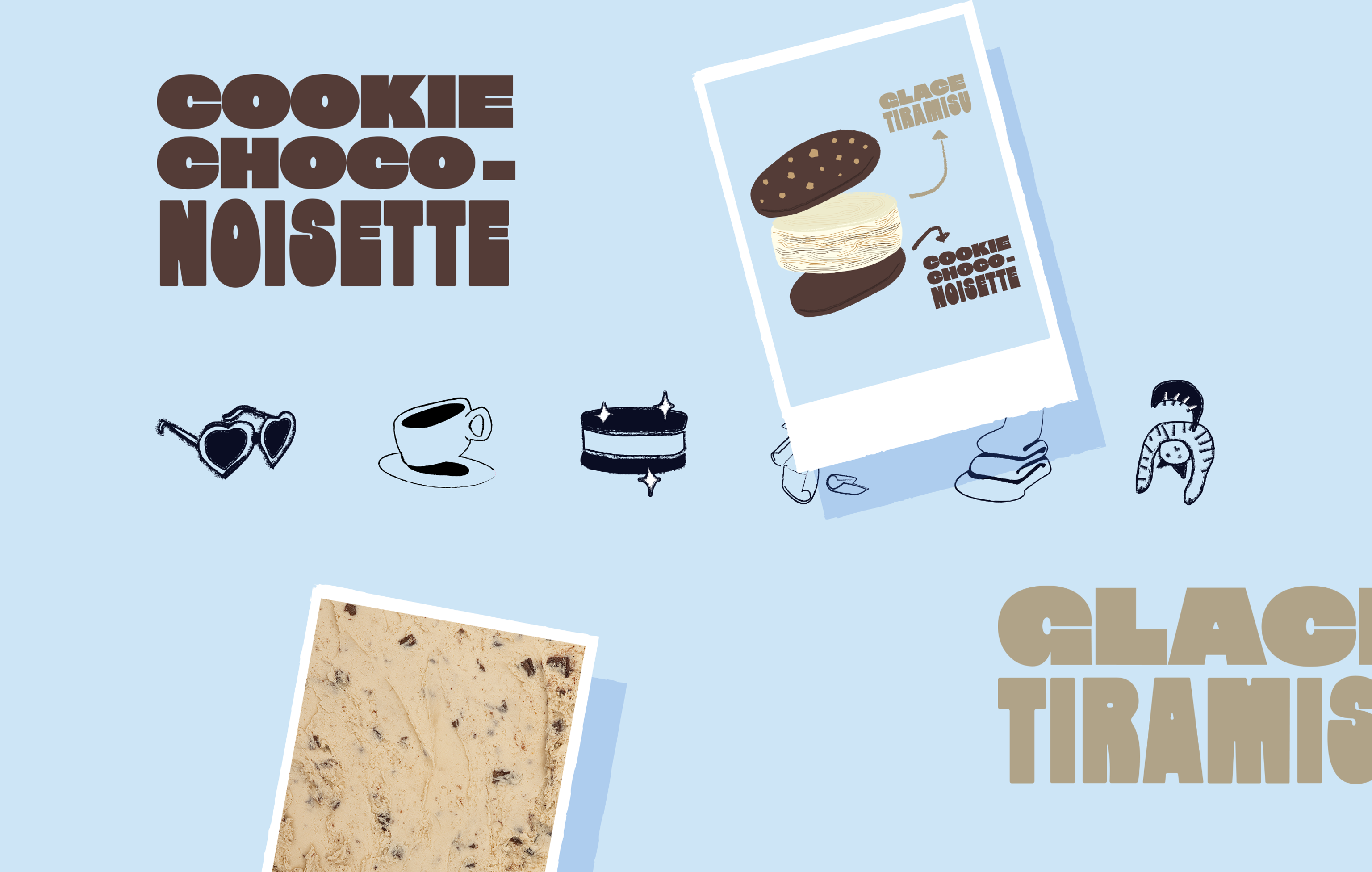
Freshly drawn, in-house

Playful in every social post
A feed that’s as tempting as the treats. We mixed behind-the-scenes, close-ups and cheeky motion so the craving lands fast.
Envie de plus ?

Small treat. Big attitude.

Bite me. Love me. Repeat.

Wear your cravings.


